One of the hottest topics in web design in 2012 has been Responsive Design - the ability for a web page to dynamically re-size to fit on a desktop, tablet or mobile phone.
The reason it is such a hot topic is simple; there is no such thing as a standard screen size any more. You can't even pick a common denominator such as 1000 pixels wide and say "that will cover most computers, from laptops up to the massive dual screen desktop you told your boss you couldn't be without".
Sometime in the near future mobile devices will out-number desktops. According to which source you read it's somewhere between 2014 and 2016. Which means you should start factoring it into your applications today.
I'm really excited that APEX 4.2 supports declarative responsive design, but it may be a while before I get to use it. In the mean time, there's no reason why you can't build it into your applications in older APEX versions today. It just requires a little more thought and ingenuity.
That's part of what I'm presenting on at the AUSOUG 2020 Foresight Conference in Perth next week.
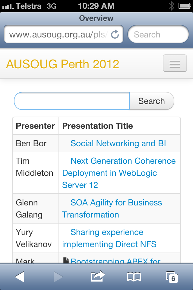
Here's a couple of screenshots from a very simple responsive application written in APEX 4.0.


The reason it is such a hot topic is simple; there is no such thing as a standard screen size any more. You can't even pick a common denominator such as 1000 pixels wide and say "that will cover most computers, from laptops up to the massive dual screen desktop you told your boss you couldn't be without".
Sometime in the near future mobile devices will out-number desktops. According to which source you read it's somewhere between 2014 and 2016. Which means you should start factoring it into your applications today.
I'm really excited that APEX 4.2 supports declarative responsive design, but it may be a while before I get to use it. In the mean time, there's no reason why you can't build it into your applications in older APEX versions today. It just requires a little more thought and ingenuity.
That's part of what I'm presenting on at the AUSOUG 2020 Foresight Conference in Perth next week.
Here's a couple of screenshots from a very simple responsive application written in APEX 4.0.

And here's the same page on a mobile phone
What's that charming expression about "eating your own dog food".